
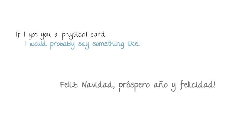
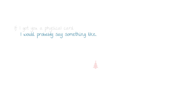

This year features a more subtle card than previous years with a focus on minimalism and smooth animations and transitions. Ultimately that reflected more on what I was saying first rather than all the flashy bits. Even though I didn’t have much time to do the cards (as usual), I did ensure to put thought and quality into what was done.

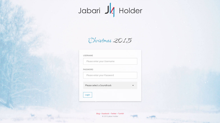
The login page took most of the time. I wanted to redo the one used in previous years because it’d been a while now since I revamped it. I went for a more interactive, straight-forward and modernized login page even though I think a lot of people might not have noticed.
This project branched into many varying aspects of modern web development technologies and a few tools to aid in greater productivity.